Frye Art Museum Rebrand
Branding & Identity
background
The Frye Art Museum has a long history as a free resource for the Seattle community. While it originally started with one singular collection bestowed by Charles and Emma Frye, over the years the museum has moved to broaden the artwork to include more experimental pieces, with a particular focus on showcasing a diversity of local voices.
Problem
How might I create a cohesive brand identity that expands market reach without alienating its current clientele?
Solution
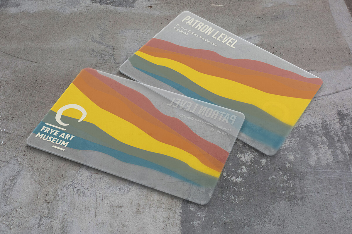
I designed a new identity that reflects the Frye’s more contemporary direction while maintaining its historic and thoughtful qualities.
jump to solution
role
Branding, Design Thinking, Visual Design, Art Direction, UI Design
collaborators
Solo Project
time
11 weeks
tools
InDesign, Photoshop, Illustrator, Miro, Figma
Client
Student project
Process
To develop a new voice for the Frye, I began with a collaborative research and discovery phase to help define the existing brand. From there, working solo, I created a concept board for the rebrand, designed a guidebook, and applied the branding to various pieces of collateral.

Process Overview
Research
By learning about the Frye’s history, mission, and current audience, we developed a base to begin thinking about the brand.
.jpg)
Frye Imagery from our Research Phase
define
personas
The Frye has a diverse audience that includes upper-income, educated households, education groups, researchers, tourists (a potential growth market), and art connoisseurs, as well as an increasingly diverse and young generation of Washington interested in less traditional art exhibits.
For our primary audience, we focused on people in their 50s-60s who have a long-time relationship with the Frye and disposable income (that could be spent on donations to the museum.) This group is primarily interested in the quiet reflection offered by the museum. They attend exhibits fairly frequently and love to support local artists.
define
Mission statement
As a group, we developed a mission statement and a brand promise to give us a base on which to build our individual concepts.

define
Workshops
Through a series of workshops, we began to build a core set of ideas to help us define the Frye. The key outcome of our discovery phase was development of three main brand characteristics.
define
Defining tone
Working independently, I built tonal mood boards for the key brand characteristics we had found in the discovery phase. This was the start of developing a visual language.
Solutions

Brand Guidebook Cover
Solutions
Logo
On the surface, the logo represents the moss covered boulder located in the courtyard, which embodies the historic steadiness that is integral to the Frye Museum. The Frye has been committed to providing free access to its collection since its inception. This founding principal is represented in the logo through an opening implying the accessibility of the museum, one of the core draws of the museum to their audience. Finally, to many patrons, a trip to the Frye is a meditative experience. I wanted to capture the feeling of balance that is integral to the experience of being at the Frye. I accomplished this by literally balancing the logo on a line.

Brand Logo
Solutions
Brand guidebook
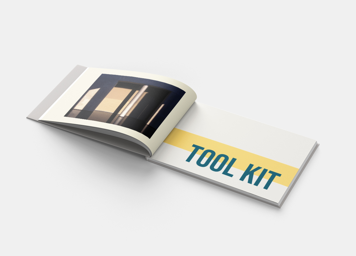
With the concept of ‘Quiet Spaces, Bold Ideas’ providing direction, I built a user-oriented brand guidebook that aids understanding of how to incorporate the new branding.
The guidebook had three main objectives:
- Articulate how to implement the brand
- Reflect the brand's visual language
- Be useable by Fyre employees who have a wide range of branding experience
solutions
full book
Full Guidebook
Reflections
final thoughts
My rebrand of the Frye captures the brand characteristics of the museum that we discovered early on: it is thoughtful, contemporary, and inclusive. The Frye’s current voice is rather quiet, so it was a very interesting process to engage in workshops to uncover these brand characteristics. I found that I really had to let myself trust the process of the rebrand and find comfort in the unknown, since much of the rebrand was spent in the discovery and concept phases.
In future rebranding processes, I would hope to have more engagement with the client. Having the opportunity to interview the staff and the directors would have provided even more insight.
Next steps
The next step would be to put the brand guidelines in the hands of a Frye employee and test its clarity and usability. I would also adapt the brand guidebook to be formatted for digital viewing, not just designed to be printed.


